Data-driven design often starts with a dashboard full of reassuring signals. Click-through rates climb, bounce rates fall, and heatmaps glow red in familiar places.
This article explores how to move from data to design decisions responsibly, showing what the numbers reveal, where they mislead, and how to design with evidence without losing empathy.
Yet users still complain. Flows still feel awkward. Small frustrations persist.
This is the quiet gap between data and design judgment.
Data-driven design is often framed as objectivity replacing intuition. In practice, it works best when data sharpens intuition rather than overrides it. Numbers reveal patterns. They do not explain motives. Charts show where users struggle. They do not tell you why.
Senior designers and product teams increasingly rely on analytics, heatmaps, and A/B tests to justify decisions. That reliance brings power and risk. Used well, data exposes blind spots and protects teams from opinion-driven debates. Used poorly, it produces shallow changes that chase metrics while ignoring human context.
This article explores how to move from data to design decisions responsibly. To begin with, it looks at what different data sources actually tell you and, just as importantly, where they can mislead.
From there, it explains how quantitative signals can be combined with qualitative insights so that numbers are always grounded in real human behavior. Finally, it shows how to design with evidence while still keeping empathy at the center of every decision.
What Data Can and Cannot Do for Design
Data excels at answering “what happened.” It struggles with “why.”
Analytics show drop-off points. Heatmaps reveal interaction density. A/B tests compare outcomes. None of these explains intent on its own.
The danger in data-driven design emerges when teams mistake correlation for understanding. A button gets more clicks after a color change. Was it the color, the position, the copy, or user expectation shaped by context? Data rarely isolates variables cleanly.
Experienced teams treat data as a map, not a verdict. It points to areas worth investigating. It does not decide solutions alone.
Design judgment still matters. Data narrows the field. Judgment chooses the path.
Analytics: Reading Behavior Without Projecting Assumptions
Analytics platforms capture flows, funnels, and events at scale. They reveal where users stall, exit, or loop. This makes analytics invaluable for prioritization.
However, analytics flattens experience into sequences. They show what users did, not what they felt.
In data-driven design, the most useful analytics questions are diagnostic, not celebratory:
- Where do users hesitate?
- Where do they repeat actions?
- Where do they abandon despite high intent?
- Which paths differ from what we expected?
For example, a high drop-off at a pricing page may not mean price resistance. It could signal confusion, missing information, or mistrust. Analytics alone cannot tell the difference.
Teams that jump directly from metric to redesign often treat symptoms rather than causes.
Analytics should trigger curiosity, not conclusions.
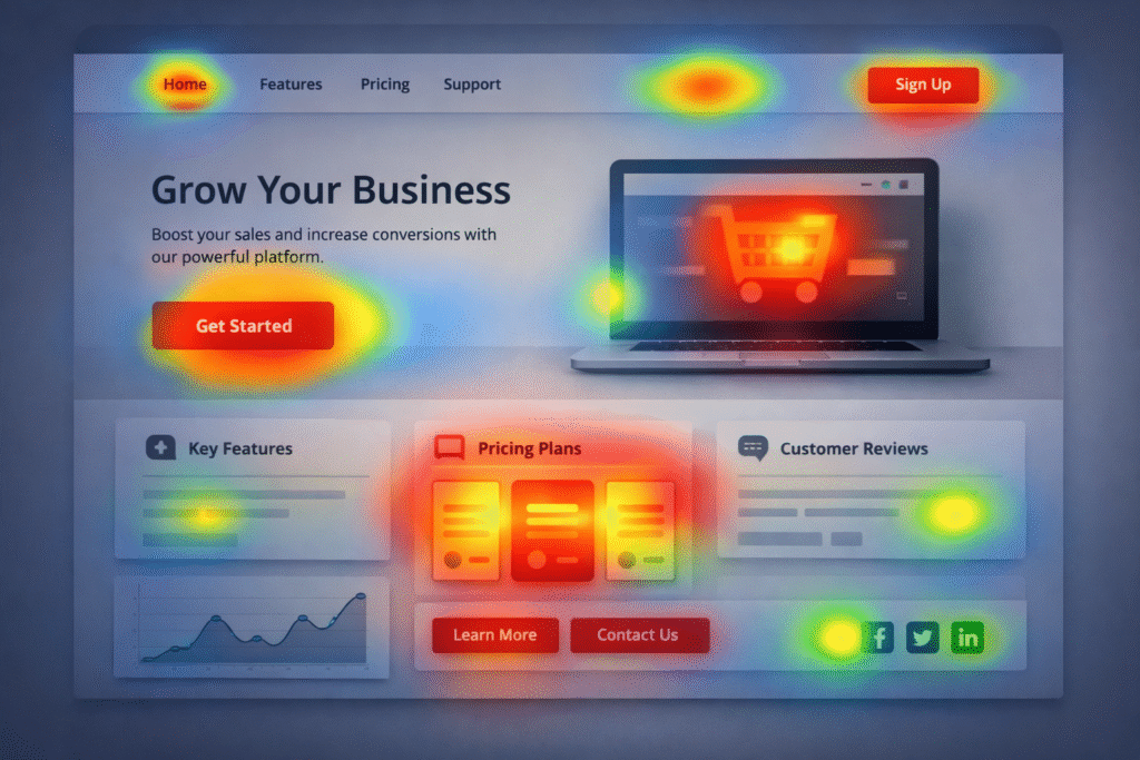
Heatmaps: Seeing Attention, Not Understanding Meaning
Heatmaps offer visual appeal and immediate insight. They show where users click, scroll, and hover. This visibility feels concrete, which makes heatmaps seductive.
Yet heatmaps require careful interpretation.
A bright cluster of clicks does not always indicate success. It may indicate confusion. Users click repeatedly when they expect something to happen, and it does not.
Scroll depth heatmaps reveal how far users travel, but not why they stop. A sharp drop may signal fatigue, irrelevance, or satisfaction.
In data-driven design, heatmaps are most effective when paired with hypotheses. You look for confirmation or contradiction, not inspiration alone.
Senior teams avoid treating heatmaps as truth maps. They use them to ask better questions before making changes.
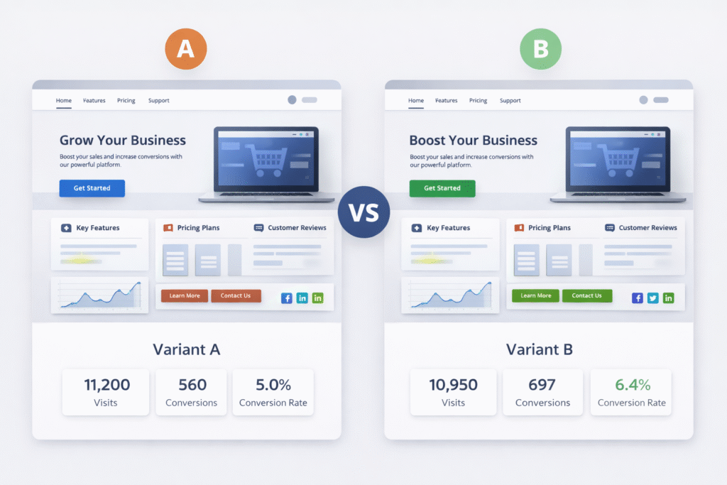
A/B Testing: Powerful, Narrow, and Easy to Abuse
A/B testing is often seen as the gold standard of data-driven design. It provides comparative results under controlled conditions. When done correctly, it reduces guesswork.
Its weakness lies in scope.
A/B tests answer one question at a time. They favor incremental changes over structural improvements. They reward local gains that may harm long-term experience.
For example, a test may show that aggressive copy increases sign-ups. Over time, those users may churn more quickly or generate a greater support burden. The test did not capture that cost.
Experienced teams use A/B testing to validate direction, not discover vision. They test refinements after a deeper understanding, not before.
Data-driven design fails when teams test tactics without questioning strategy.
Designing Hypotheses Before Designing Screens
Strong data-driven design starts with hypotheses, not visuals.
A hypothesis connects observation to intent. It states what you believe is happening and why a change might help.
For example:
Users hesitate at checkout because shipping costs appear late and feel unexpected.
This hypothesis guides what data to examine and what design change to test. Without it, teams redesign blindly and hope metrics improve.
Hypotheses keep data and design aligned. They prevent random iteration and metric chasing.
Designing without hypotheses turns data into noise.
Combining Quantitative and Qualitative Signals
The richest insights emerge when numbers meet narratives.
Quantitative data shows scale. Qualitative feedback shows meaning.
Session recordings, usability tests, and support tickets provide context that analytics cannot. A heatmap may show hesitation. A user interview explains the fear behind it.
In data-driven design, qualitative input prevents misinterpretation. It explains anomalies and grounds decisions in human experience.
Teams that separate research from analytics miss opportunities. The two should inform each other continuously.
Data points gain weight when paired with real voices.
Avoiding Metric Myopia
Metrics shape behavior. Teams optimize what they measure.
When conversion is the only goal, clarity may be sacrificed. Rewarding time-on-page can make interfaces verbose. And when engagement is king, friction is often disguised rather than resolved.
Data-driven design requires metric literacy. Teams must understand what a metric represents and what it ignores.
Healthy teams balance leading and lagging indicators. They watch immediate outcomes and long-term signals like retention, satisfaction, and support volume.
Design decisions should serve users first. Metrics should confirm success, not define it.
The Ethics of Data-Informed Interfaces
Designing with data carries ethical weight.
Behavioral data can be used to guide or to manipulate. Dark patterns often emerge from over-optimization, not malicious intent.
For example, reducing friction to increase conversions may also reduce informed consent. A design that hides consequences performs well in tests but harms trust.
Senior designers recognize that data-driven design must include value-driven boundaries. Not every measurable gain is worth pursuing.
Long-term trust outperforms short-term wins.
Organizational Realities and Data Interpretation
Data does not exist in a vacuum. Organizational pressure shapes interpretation.
Stakeholders may cherry-pick metrics to support preferred outcomes. Designers may feel forced to justify intuitive decisions with weak data.
Strong design leadership acknowledges uncertainty. It communicates confidence without false precision.
In mature teams, data informs discussion rather than ending it. Decisions reflect evidence, experience, and user advocacy together.
Data-driven design thrives in cultures that value learning over certainty.
When Data Says Nothing New
Not all decisions require data.
Some usability principles are well established. Clear labels outperform vague ones. Immediate feedback reduces errors. Familiar patterns reduce learning time.
Over-testing obvious changes wastes time and creates false rigor.
Experienced teams know when to trust established knowledge and when to seek validation.
Data-driven design includes knowing when data is unnecessary.
Building Feedback Loops That Actually Improve Design
Data becomes useful when it feeds back into the design cycle.
Teams that collect metrics without revisiting them fall into performative analysis. Dashboards get built. Insights fade.
Effective teams review data regularly, reflect honestly, and adjust thoughtfully. They document learnings, not just wins.
Design maturity shows in how teams respond to unexpected results. They investigate rather than dismiss.
Learning compounds when feedback loops stay active.
Conclusion: Designing With Evidence, Not Illusions
Data-driven design does not replace design thinking. It sharpens it.
Analytics reveal patterns. Heatmaps expose friction. A/B tests validate direction. None of them understands users on their own.
The real skill lies in interpretation. It shows in asking better questions, resisting shallow conclusions, and balancing evidence with empathy.
When data and design work together, decisions feel grounded and humane. Interfaces evolve with purpose rather than impulse.
Designing from data is not about certainty. It is about reducing blind spots while keeping users at the center.
FAQs About Data-Driven Design
What is data-driven design?
Data-driven design uses behavioral data to inform design decisions while combining evidence with design judgment.
Are analytics enough to guide design?
No. Analytics show what users do, not why. Qualitative insights are essential for interpretation.
How do heatmaps help design decisions?
Heatmaps reveal interaction patterns and hesitation points, helping teams identify areas for deeper investigation.
When should A/B testing be used?
A/B testing works best to validate specific changes after understanding the underlying problem.
Can data-driven design harm user experience?
Yes. Over-optimization can lead to manipulative patterns if ethics and context are ignored.