The page loads. Icons spin. Cards slide. Backgrounds shimmer. At first, delicate transitions were meant to feel pleasant. However, customers feel uncomfortable. As a result, attention wanders. Then, scrolling slows. Soon after, actions are delayed. Digital design has always exalted animation as a way to bring interfaces to life, present hierarchical information, and create moments of delight for the user. Moreover, minor interactions, hover effects, and feedback loops can improve comprehension and satisfaction. Yet, as a tool, movement becomes a liability when designers misapply it.
In turn, it can saturate thinking, create confusion, and even damage performance indicators. Therefore, this paper examines dark user experience animations. Specifically, we discuss why excessive or poorly introduced motion aggravates users, reduces conversion, and increases mental workload. Furthermore, drawing on research, industry behavior, and real examples, we examine where animation crosses the line from enhancement to distraction and how senior designers can use motion responsibly.
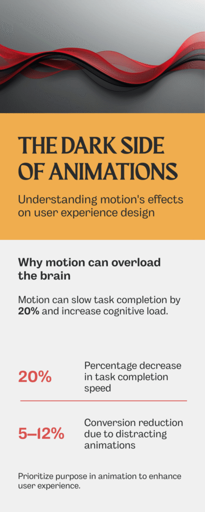
Why Motion Can Overload the Brain
Human beings are programmed to perceive movement. Motion as a danger or opportunity signal was rewarded in evolutionary biology. In computer interfaces, animation is overused, and it raises the same alert system when it is not necessary. All the motions increase cognitive load. Users have to make sense of transitions, follow motion, and compensatefor changes with expectations. When movement is everywhere: loading, rotating items, pulsing buttons, sliding cards, the user will be using mental energy, but in processing visual noise rather than performing the task.
Another study conducted by Nielsen Norman Group in 2017 calculated that animation is often harmful to the understanding process; people who are distracted by the constant movement understand the task considerably slower, up to 20 percent slower. The brain interprets all animation as a signal to be processed, although it does not bring any functional value.
Micro-Interactions Gone Wrong
Micro-interactions are those small animations that can be missed and that are supposed to help understand something behind the scenes. When properly designed, they are instinctive and nearly indistinctible. They are disruptive when excessively used or overdone.
Examples of misuse:
Buttons that jiggle on hover excessively
Overly long transitions between states
Repeating loading animations for minor interactions
In such situations, users do not find a useful cue; they find the delay. The interface is less responsive, heavy, and slower. The shadow of animations is not in the fact that there is no motion, but in the fact that it does not correspond to the expectation of the user.
Animation and Conversion Metrics
Oversized movement influences transformation directly. Friction is sensitive to users who are reviewing products or filling forms. Every superfluous delay, motion, or visual distraction enhances hesitation. According to A/B testing by various e-commerce teams, the conversion rate might decrease by 5-12 percent with the addition of long or decorative transitions to the checkout steps.
The interface becomes slower or more cumbersome for the users. Microcopy and CTA placement are less efficient because the motion leads the focus out of the essential action. Even small visual effects, such as bouncing buttons or auto-scrolling features, may demand enough cognitive load as to lower the click-through rates or abandonment recovery.
Visual Disorientation and Motion Sickness
Not all motion effects are strictly intellectual. Some cause physical pain. Dizziness or nausea can be caused by parallax scrolling, intricate 3D effects, or quick zoom effects, especially when used by a person who is sensitive to the vestibule. This is increasingly acknowledged by the modern UX standards.
The W3C accessibility rules (WCAG 2.1) will suggest providing the user with control of motion to exclude the possibility of vestibular stress. The disregard of these recommendations poses an obstacle to the neurodiverse users and the motion-sensitive. Decorative motion that is not functional may put off users completely.
The Illusion of Progress Can Backfire
Progress can be indicated by animations, such as spinners, sliding loaders, or skeleton screens. Though these cues minimise the perceived waiting time, too much or mismatched motion may counterproductively affect waiting time. Extensive animated transitions can cause a system to feel slower than it would be the case with static feedback. Skeleton screens, which hyper-animate various parts of the screen before content is loaded, confuse the user and make it seem like the display is unresponsive.
The users can either give up on the task or misunderstand the responsiveness of the system. The negative aspect of animations is perception: a minor delay enhanced by redundant movement will be perceived as a malfunction of the system.
Hierarchy and Focus: When Motion Conflicts With Priority
Directing attention is one of the main functions of animation. Motion will provide hierarchy: it will bring to the fore new information, attract attention to calls to action, and indicate change. This signal is destroyed by overuse. Several dynamic components interact, producing an interface that is noisy.
The users are unable to differentiate between what is significant and what is ornamental. Important operations, forms, approvals, and purchases become unclear. Mature UX departments acknowledge that each animation must have one purpose. Where there is an overlap of multiple cues, usability suffers, despite visual polish.
Cultural and Contextual Sensitivity
Motion has many interpretations by users depending on the context. Animation is no longer merely decorative in high-stakes settings, such as finance dashboards, medical records, or enterprise software, where it can indicate instability or fault.
There is also an influence of cultural expectations. In some areas, the presence of pulsing, bouncing, or swift changes is viewed as urgency, whereas in others, it is frivolity. Something playful in one context might jeopardise credibility in another. Over animation is, therefore, not neutral; it has emotional and cultural content.
Accessibility Considerations
Accessibility is inextricably related to motion. Animations may cause vestibular problems, distractions to users of a screen reader, or may be incompatible with magnified layouts. Unnecessary movement contravenes the concepts of fair UX, which decreases trust and satisfaction.
WCAG recommends:
Providing options to reduce motion
Avoiding automatic, looping animations
Ensuring transitions do not interfere with comprehension
Ignoring these guidelines is not just a design flaw; it is an exclusionary practice.
Real-World Case: Reducing Motion for Efficiency
Several large SaaS companies reported improved engagement after simplifying animations. Examples include:
Replacing bouncing notifications with subtle color changes
Shortening transition durations on dashboards
Removing decorative motion from onboarding flows
Results: faster task completion, higher perceived speed, and lower abandonment rates. Users felt the interface was more responsive and professional.
This underscores a critical principle: motion should communicate, not decorate.
When Motion Still Works
Not all animation is harmful. Properly applied, it:
Reinforces affordance (buttons that depress subtly)
Clarifies hierarchy (highlighting new or updated content)
Smooth transitions (sliding cards that maintain spatial context)
Signals system feedback (progress bars, brief loaders)
The difference lies in restraint, alignment with function, and minimal cognitive burden.
Best Practices to Avoid the Dark Side
Prioritize Purpose – Every animation must convey meaning or facilitate understanding.
Limit Duration – Transitions should be quick, not ornamental.
Reduce Repetition – Avoid repetitive motion that does not add clarity.
Enable Control – Allow users to disable non-critical motion.
Test With Real Users – Observe impact on attention, speed, and satisfaction.
Align With Hierarchy – Ensure motion highlights, not competes with, priority actions.
Senior designers treat motion as a communication tool, not decoration.
Conclusion: Motion as a Double-Edged Sword
The animations may amuse, inform, and direct, or may confuse, annoy, and estrange. The negative aspect of animations is experienced when movement goes beyond cognitive, emotional, or contextual levels. It decreases understanding, trust, and conversion. It does not convey sense but sound. Movement must be muttering, not noisy.
It must support, not be in competition. Its intentional use adds value to UX and does not attract attention to itself. As an abuse, it turns into a wall that cannot be seen by the user until they realize the reason. Restraint, purpose, and empathy in designing will make sure that animation is used as a tool to understand and not an impediment.
FAQs About the Dark Side of Animations
How can excessive animation harm UX?
It increases cognitive load, distracts from tasks, slows perception, and can cause frustration or abandonment.
Do animations affect conversion rates?
Yes. Studies show long or decorative transitions can reduce engagement and conversion by increasing perceived friction.
Are animations a problem for accessibility?
Excessive motion can trigger vestibular issues and interfere with comprehension for users with cognitive or visual sensitivities.
*Learn more about vestibular issues from an article published by the Cleveland Clinic. Click on the above link.
When should animation still be used?
Use animation to communicate state, hierarchy, feedback, or transition smoothly, but only when necessary and minimal.
How can designers test the impact of animations?
User testing focused on speed, task completion, comprehension, and subjective comfort provides actionable insight.